Designing a Drag & Drop Experience for the Web
The Art of Drag & Drop Uploading – Part 1
Easy document sharing is at the heart of Onehub’s features and functionality. It’s crucial that you find our site both powerful enough to handle all your fils sharing needs and intuitive enough to take care of those tasks at the click of a button.
Approaching shiny, new features
When designing new features (especially those involving new technology), I design them for the person who has never used the service before. I do this for two reasons. First, it frees me from any expectations I might be aware of from existing customers. This allows me to focus on how the feature should be, rather than how it could be. Second, when I design for new users first, I’m less likely to forget about them during my creative process. Once I’ve isolated what I think is the best idea for new users, I go back and connect the dots for existing customers.
I imagined a new drag & drop files widget for document sharing and tackled the most obvious and important question that came to mind.
Where do I drop my files?
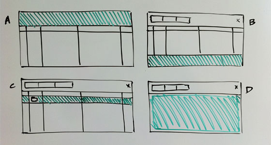
The drop target not only dictates how someone initiates a drag & drop upload, it also influences the rest of the user experience. I sketched several ideas and ended up with four options for consideration.

- Drop the files on to the menu bar
- Drop the files on to a new, unique location
- Drop files anywhere on the file list and/or in to a folder
- Drop files anywhere on the file list
Option B. The first to go. The most intuitive place to create a unique target for adding files would be below the other files (in a footer); however, that would require a ton of scrolling if you had lots of files. Moving the target further up solved the scrolling issue, but was less intuitive and wasted screen real estate when not in use.
Option A. Next off the list. It made contextual sense because it was close to the current Upload button, but that was about it. I anticipated dragging files from the bottom and side of the browser window. Hitting the target on this option could require a lot of mouse movement. Additionally, the drop target felt fairly small.
Option C. The early favorite. A few team members really liked the idea that you could drop a file directly in to a subfolder. This approach was more complicated though because it actually consisted of multiple drop targets. After sitting with this option for a bit, dragging in to a subfolder didn’t seem to be very useful either. Anything more than a single nested folder still required traditional navigation. The real killer for me though was that the targets were even smaller than in Option A. It would be easy to accidentally drop files in to a subfolder and/or into the wrong folder. The cool factor wasn’t worth the increased risk of error.
Option D. The winner. It was intuitive and very accident-proof. It also had the largest drop target which I felt would be the most engaging and easiest to use. Other than not being able to drop files in to folders, we couldn’t find anything that we didn’t like about this approach at first glance. It was time to prototype.
Early prototype gets the bugs
At Onehub, we prototype as early as possible. Playing around with prototypes, no matter how basic, gets you thinking like an actual user. Also, this is typically where the largest number of changes occur in my designs. The earlier I reach the prototype phase, the quicker I become confident in the feature.
While using the document sharing prototype, I noticed that we weren’t conveying one very important detail about the uploader – you shouldn’t touch the files widget during an upload. With Option D, the menu bar and sort headers were still available during an upload. The widget did not appear to be fully ‘locked’. You could easily click any button in the menu, including the ‘Upload’ button. Ironic.
The solution was easy – expand the drop target to surround the entire files widget. The entire widget became one huge drop target and the experience of dropping files felt right.
Keeping feedback simple, Stupid
I felt strongly that the most important thing to get right was going to be feedback. One thing I learned from our original uploader was that the interface quickly became cluttered when displaying data & progress for individual files. So, I wanted to see if I could keep feedback comprehensive without displaying too much information.
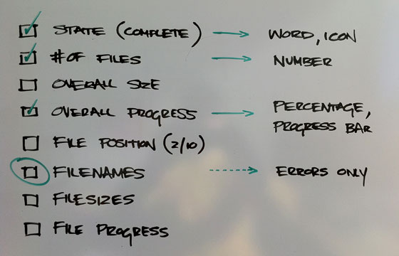
It is easy to add things; harder to take them away. So, before showing the prototype to the rest of the team for the first time, I removed anything I didn’t absolutely need to know about a given upload. I made a list of all the data at my disposal and started pruning.

I ditched overall size for two reasons. One, your brain automatically figures out the ‘size’ of an upload by combining the number of files with how fast the progress bar is moving. Two, most users don’t know/care how much bigger 3.6 MB is than 3,600 KB.
Next, I axed all information pertaining to individual files for the reasons stated above, with the exception of filename. This was necessary for informative error handling. If there was an issue with one or more files, Leigh and I had decided to continue, successfully uploading everything else. Given that scenario, it would be nice to know which files didn’t get uploaded so you could try them again.
As it turns out, uploading files via drag & drop happens concurrently. At any given moment, three or more files are in transit. To provide accurate feedback on individual files we would either need to disable concurrent uploads (slow down the uploader) or show progress bars for all of the files in transit (clutter the interface). If my intuition was sound, we wouldn’t need to do either of these. Bonus.
In the end, I settled on state, number of files and overall progress. Minimal and meaningful. If anyone on the team felt something was missing, I was confident it would eventually work its way back in.
The rest was easy
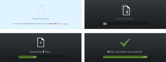
Once satisfied with the document sharing drop target and the feedback requirements, the rest of the interface fell in to place. I opted for an overlay, which provided a consistent minimum width & height, and designed unique panes for each of the five interaction states – ready, drop, uploading, success & error.

A better experience is always the best new feature for document sharing
I didn’t want there to be any question as to why you should use our new uploader over existing options and I think we succeeded. The drag & drop uploader is faster and more reliable, doesn’t require a single mouse click or browser plugin, looks beautiful and is fun to use.
If you’re using Chrome, Safari or Firefox please give the new uploader a try and let us know what you think. If not, it is definitely time for an upgrade. The future is coming!
In my next post, I’ll document how we built our progress bar without a single image using CSS3.
If you’re interested in taking advantage of these powerful document sharing features, sign up and get started with Onehub today.